Mastering Mobile Typography: Font Usage Tips and Best Practices
Don’t let inconsistent typefaces or subpar spacing impede accessibility or hurt your brand. These mobile typography guidelines will help enhance user experience and increase engagement.
Don’t let inconsistent typefaces or subpar spacing impede accessibility or hurt your brand. These mobile typography guidelines will help enhance user experience and increase engagement.
Charles is a UI/UX designer and brand strategist with extensive experience in mobile-first design. He has worked with multinational companies such as Netflix and TikTok, and has also served as a creative director, supervising teams on high-level design projects, including redesigning websites and mobile apps.
Expertise
Previous Role
Creative DirectorPREVIOUSLY AT


Featured Experts
Previously at Google
Previously at J. Walter Thompson Worldwide
Typography significantly impacts how users perceive a brand and interact with its mobile apps. Smart typographic choices ensure legibility, establish a clear visual hierarchy, and express brand identity.
While every app designer has their own style and approach to typography, designers can ensure their mobile app text is effective by applying fundamental design principles, understanding user expectations, and evolving with mobile technology and trends.
As a UI/UX designer with extensive experience in mobile-first design, I understand the importance of using the right font styles, sizes, and arrangements to create visual harmony on smaller screens. Here are five guidelines for designing practical and appealing mobile typography, including choosing a suitable typeface for your app and making your design accessible to all users.
Focus on Readability
When choosing a typeface for your mobile app, your primary concern should be readability, which is essential for content consumption, accessibility, navigation, brand consistency, and reducing user errors. While readability plays an important role in the user experience of all digital products, it is paramount in mobile apps, where limited space and reduced user attention spans make quick and clear communication key.
In my work for the food delivery app NOM NOM I prioritized clear typography and legible fonts across the app to make sure users could easily read menu item descriptions, prices, and allergy information. I also optimized the readability of navigation elements including categories, filters, and buttons, helping users to smoothly explore the app and successfully place an order.
When evaluating fonts for mobile typography, take these factors into account:
Serif vs. Sans-serif Fonts
Of the five typeface categories, mobile designers typically choose serif or sans-serif fonts for their apps. Both have distinct characteristics that can impact an app’s aesthetics and readability.
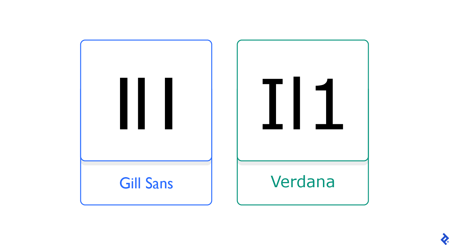
Serif fonts make it easy to distinguish between certain characters (capital “I” versus lowercase “l” versus the number “1,” for example). While these fonts used to be mostly associated with printed materials, advances in screen resolution mean that they are increasingly used in digital products such as mobile apps.
Georgia is an elegant and legible serif font that is used by reputable institutions such as The New York Times on both its website and mobile app. Its letterforms, with their thick strokes, open apertures, and large x-height, make it easy to read even at small sizes. There are, however, some serif fonts that should be strictly avoided in app design. Be wary of overly stylized serif fonts such as Old English; with their scripts, shadows, outlines, and ornamentation, these fonts can be particularly hard to read on small screens.
In contrast, most sans-serif fonts work well where there’s limited room for copy. They are often used in mobile apps because their clean and simple design makes them easy to read on small and low-resolution screens. One example of a highly legible sans-serif typeface is Roboto, a modern, geometric typeface developed by Google for the Android mobile operating system.
Font Pairings
Font pairing combines different fonts that complement one another to create harmony and balance within a design. However, using multiple typefaces for mobile app content must be done carefully to ensure that the reader, who could be on the go or multitasking, can absorb information quickly and effectively. Moreover, designers should avoid using many different combinations of fonts as these can slow down page loading, a big deterrent for mobile users.
To ensure that a font pairing enhances your app’s user experience, Toptal designer Karlie Chung suggests using a typographic system that defines the typeface, style, size, spacing rules, and other elements that you’ll use for the different types of copy in your app including headings, body copy, captions, menus, and UI buttons. If you’re working with an established brand, there may already be a system or style guide in place that you will need to follow. However, if you’re creating your own from scratch, I recommend taking a look at Kimberly Elam’s book Typographic Systems and her discussion of different rules and guidelines for typography and how to organize text within a digital design.
If you decide to employ a single typeface for all text, you can use different font weights, styles, and sizes to add contrast and create a visual hierarchy. Heavier weights should be used to add emphasis to headings. In general, medium weights should be favored over light and regular weights in app body copy for optimal readability. Likewise, bold type can highlight specific sections of text that you want to bring the reader’s attention to.
Imposter Letters
To ensure high readability, avoid fonts that have “imposters,” or letters that look identical side by side. A zero can be mistaken for a capital O, and a lowercase L can be confused for a capital I or the number 1 on smaller screens. Confusing characters are especially problematic when displaying content such as authentication codes that users must enter manually. If multiple characters look too similar, and you foresee confusion for the reader, consider changing your font.

Consider the “Clickability” of Your Text
Selecting the correct font size for headings, subheadings, and body copy is essential for creating a harmonious visual experience and ensuring that information is readable—and clickable—on smaller devices. When arranging typography for apps, the challenge is to make text large enough to accommodate touch interactions so users can accurately tap links or buttons, but not so large that it takes up the entire screen or requires excessive page scrolling.
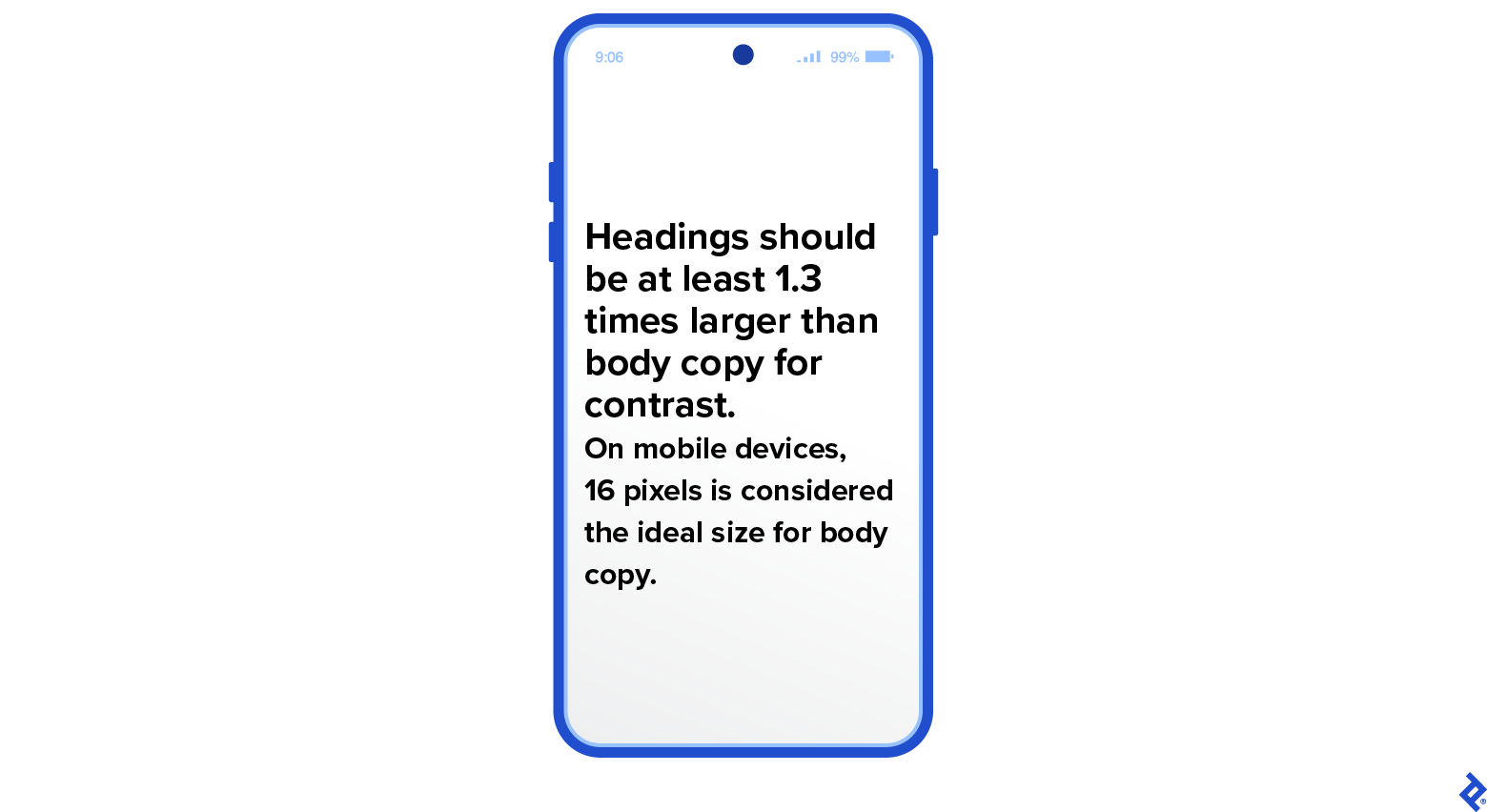
In terms of app font size, a good rule of thumb is a minimum type size of 16 pixels for body copy with headings being around 1.3 times larger than that. (Another option for mobile design is to use the golden ratio, in which headings should be 1.618 times larger than body copy.)

Designers can also make use of ready-made mobile typography systems and tools, with predefined properties and styles. The online typographic scale tool Typescale, for example, allows you to visualize your text within the hierarchy of the page and create different-sized scales depending on the screen you’re designing for.
Establish a Clear Hierarchy
Correct use of font size, style, color, weight, case, and contrast can help users quickly identify and understand what’s most crucial on the screen. An effective typographic hierarchy draws the eye to the most important copy and gives meaning and context to each content type (e.g., headings, subheadings, and body copy). Toptal product designer Brian Carter recommends using a grid system to ensure elements are aligned, well proportioned, appropriately spaced, and uncluttered. Some additional considerations to help you establish a coherent ranking include:
Line Spacing for Body Copy
Proper spacing, including line height, letter spacing, word spacing, margins, and padding, is key to readability, especially on smaller screens with less white space to guide the user’s eye from one piece of content to the next, says Chung. Optimal line spacing (or leading) varies depending on the type of copy. For mobile body copy leading should be about 1.6 times the font size. This creates more white space between the lines to avoid crowding and limit eye fatigue.
Line Spacing for Headings
To communicate hierarchy in your mobile design, your headings must stand out against the accompanying body copy. An easy way to do this is to create space around the heading or to remove space between long titles that run over multiple lines. Maybe a heading runs two or even three lines on a mobile screen; decreasing the leading between these lines will make it clear to the reader that the heading is separate from other text types. As a general rule for headings, leading should be around 1.2 times the font size; for subheadings, it should be 1.4. In my experience, one other important guideline about spacing is illustrated in the graphic below: If a heading is in all caps, the height of the space between lines should match the width of any letter’s stem—or be up to 1.2 times its width.

Eyebrow Text
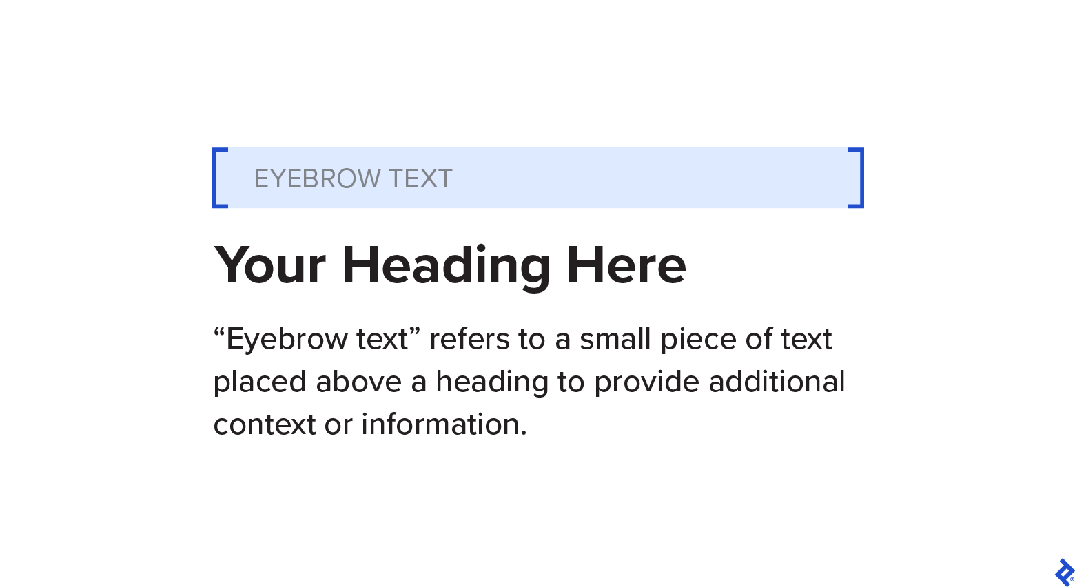
To attract extra attention to your heading, consider adding eyebrow text, which sits just above the first words of a heading. This text offers a brief explanation of the features or content and serves as a valuable tool to guide users effectively through the mobile interface, facilitating user-friendly navigation and drawing them into the main content.

In mobile design, the intention behind eyebrow text is to give readers an instantaneous grasp of what to expect on the page. It allows them to scan the content and consume it more quickly, according to Carter, who has used this feature in several app designs, including digital Wallet app Meteor.
Make Your Mobile Typography Accessible
There are several ways to ensure your mobile typography is accessible to all, including users with low vision, blindness, color blindness, and dyslexia. Firstly, remember that long lines of text can be difficult to follow for low-vision users or those with a small field of vision. Length isn’t usually a problem in portrait mode, due to the narrow viewport, but try to limit line length to 80 characters in landscape mode.
Secondly, consider offering a manual option for adjusting font size to help users avoid eyestrain. Dark mode is also a valuable feature for low-vision users, but make sure that there is sufficient contrast between the text and background colors. Poor contrast can make text hard to read, especially in the bright light of a backlit screen.
When designing typography for apps with screen readers—assistive software programs that convert text and other on-screen elements into synthesized speech or Braille output—there are a few things to remember. Screen readers can misinterpret letters that are very close together or overlap, making serif fonts, italics, and all caps challenging to translate. Very thin or lightweight fonts are also problematic. In a recent webinar, Jacinta Oakley, UX designer and consultant for Vision Australia, suggested using a humanist sans-serif typeface like Calilbri, Verdana, or Tahoma. These fonts have large x-heights, ample open space, and unique letter shapes, making them ideal for screen readers. Another font with these characteristics is Proxima Nova, which has made many top 10 lists for best fonts for mobile and digital UI/UX.

Always Test Your Typography
By conducting comprehensive tests on mobile typography, designers can go beyond looking for bugs to ensuring that their chosen fonts, sizes, and styles enhance usability and ultimately contribute to an app’s success, says Chung. Tools like Font Tester, Fonts Ninja, and Typetester can measure readability and legibility, while usability and UX testing tools like UserZoom, UserTesting, and Optimizely let you do surveys and polls to gather quantitative and qualitative data.
You can also seek feedback from your team and external testers. While the design team looks for and refines visual flaws, external testers simulate various user interactions performed via touch, keyboard, and other inputs to uncover functionality errors. When evaluating the use of typography, testers might also look for type that is too small or too large for the screen resolution. Based on the testers’ feedback, the design team can iterate to ensure their designs align with the desired objectives.
Mobile Typography Guidelines: Stay Up to Date
Typography for mobile design continues to evolve with the times and user preferences. I urge you to follow design leaders, join design communities, and read up on mobile trends in order to stay up to date on the latest in mobile typography. Consider participating in designer forums or joining events that discuss typography; you can also follow hashtags and accounts such as #typography and @typocircle that curate typography content on X (formerly Twitter).
Creating good typography for mobile apps goes beyond applying fundamental guidelines—it’s crucial to understand users so we can create a welcoming space where they can interact and engage with our brands and products.
Further Reading on the Toptal Blog:
Understanding the basics
What are the typography guidelines for mobile apps?
Typography for mobile apps should be readable and consistent. Follow conventional text best practices and choose a legible font size. Establish a clear hierarchy between content types as well as visible contrast between text and background. Give sufficient space in the tracking and leading for optimal readability.
What is the typography scale for mobile apps?
Mobile app font size should be readable, but not take up the entire screen. The standard minimum is 16 pixels for body copy, and headings that are 1.3 times larger than the body. For customized sizes, use the golden ratio or typographic scales and tools such as Typescale.
Which font should I use in mobile app design?
When choosing a font for your mobile app, first determine if the brand has a system typeface in place. For example, Apple’s iOS uses San Francisco, while Android uses Roboto. These sans-serif fonts are designed for high readability on mobile screens. A brand can have a customized font, but designers must consider user readability and clarity, as well as adhere to the brand’s style guide.
Legazpi City, Bicol, Philippines
September 9, 2022
About the author
Charles is a UI/UX designer and brand strategist with extensive experience in mobile-first design. He has worked with multinational companies such as Netflix and TikTok, and has also served as a creative director, supervising teams on high-level design projects, including redesigning websites and mobile apps.
Expertise
Previous Role
Creative DirectorPREVIOUSLY AT


