Pragmatic Pixel Perfection: A Manifesto for Balancing Design Quality and Speed
Product teams face a dilemma: Achieving pixel-perfect design requires significant time and resources, but rushing to launch can result in mediocre products. This UI guide explains how to design excellent products while balancing quality and speed.
Product teams face a dilemma: Achieving pixel-perfect design requires significant time and resources, but rushing to launch can result in mediocre products. This UI guide explains how to design excellent products while balancing quality and speed.
Damir is a digital designer who has created payments systems at Booking.com, open-data portals for Australian state governments, and the search experience at Envato Market. He has also facilitated design sprint workshops at Harvard University, been a lead UX instructor at General Assembly, and led AR/VR design at Archimedes Digital.
Previous Role
Lead Product StrategistPREVIOUSLY AT

There are generally two philosophies at play among product teams, particularly at startups: the push to make the best product in a market and the push to take a product to market quickly. Quality on one hand, speed on the other. Each approach has its merits—and drawbacks.
A laser focus on quality—or pixel-perfect design—requires significant time and resources. But rapid design—which frequently means sacrificing best practices in order to rush a launch—can result in a mediocre product. Both of these options cause problems for businesses and make it difficult to gain a competitive edge. The cornerstone of a successful product strategy is the ability to balance these two contradictory strategies.
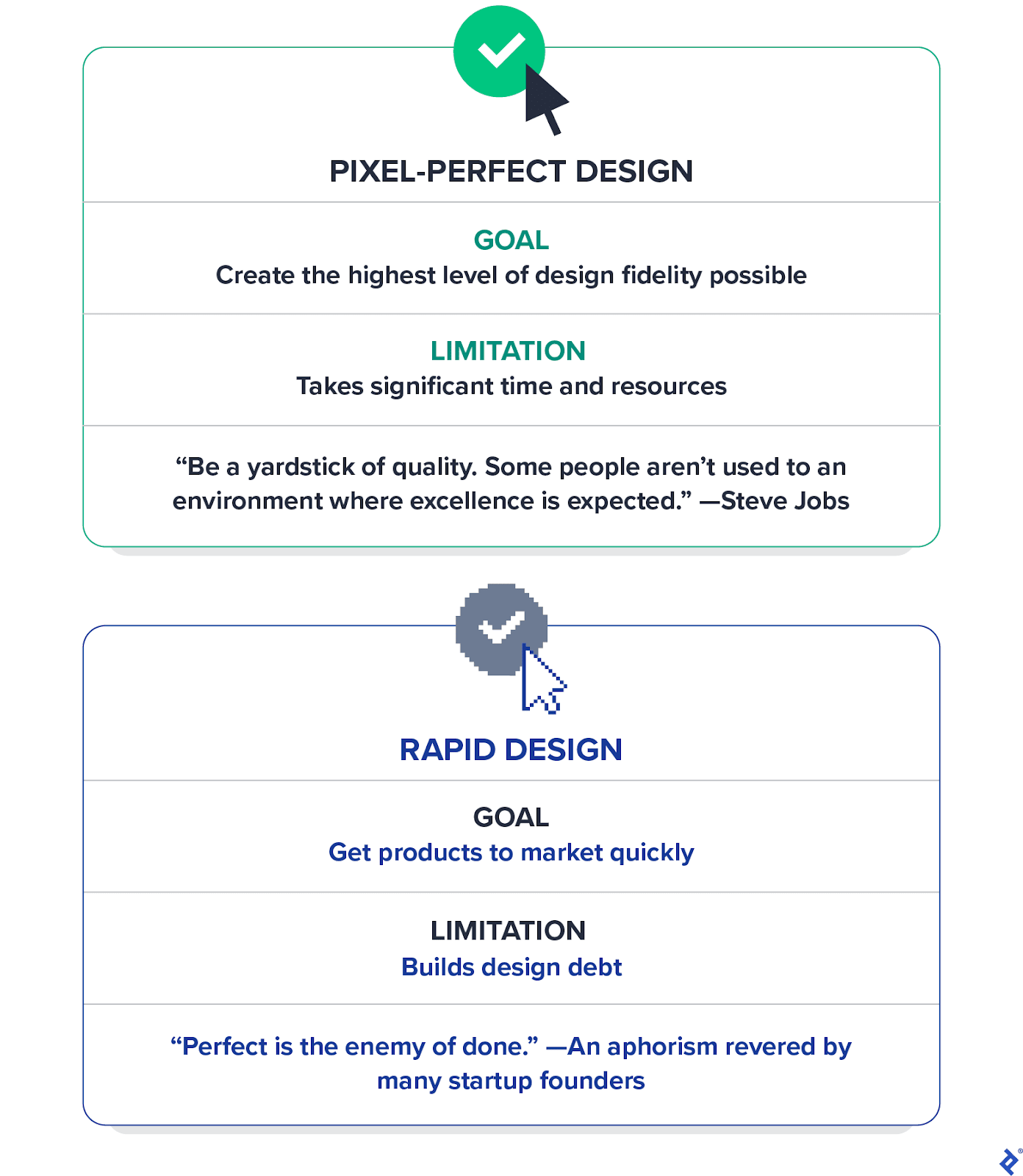
Striking a balance is easier said than done because quality and speed are subjective. However, having worked on design projects for many startups, I believe the right balance exists. I call it pragmatic pixel perfection.
This manifesto takes us into the trenches of UI design, where the battle between speed and quality is waged. While this guidance is geared toward helping startup product teams stay balanced and on track, any UI designer, product team, or organization aiming to make exceptional products quickly can use these 10 principles to achieve pragmatic pixel perfection.
Prioritize Website Performance
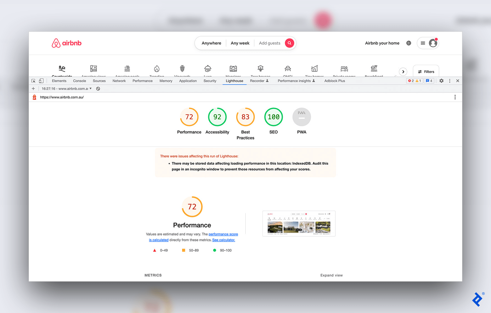
Most entrepreneurs I’ve worked with don’t rank web performance high on their list of business priorities. They often focus on growing the product and the business and may neglect critical factors like performance, accessibility, and SEO. But each of these factors impacts the company’s growth.
Page speed, in particular, has a striking impact on conversions. Google incorporates page speed into its rankings, meaning poor performance could hinder your site’s search ranking and reduce its page views. Research has also revealed that the conversion rates of e-commerce websites that load in one second are more than two times higher than those for sites that load in five seconds.
You can audit your website for free with Google’s Lighthouse, a tool that scores websites on performance, accessibility, SEO, and other crucial factors. It also offers suggestions for improving weaker areas. To strengthen accessibility, for example, the tool may suggest increasing the contrast of background and foreground colors for enhanced legibility. Meeting Google Lighthouse’s requirements is sufficient for most websites, but if you’re designing for a government or major corporation, you may face more stringent requirements.
Use an Off-the-Shelf Design System
Design systems create a shared language among designers and developers and support consistency across products, saving companies time (and money). That said, startups—and even many established organizations—don’t need a bespoke design system. Instead, they can adapt a ready-made system like Google’s Material Design, IBM’s Carbon, or Ant Group’s Ant Design. Designers and developers have already invested thousands of hours of work into these successful systems, and it’s simply a waste of time to reinvent industry-standard atomic UI components.
However, I’ve heard the argument countless times that if designers continue to use off-the-shelf design systems all websites will look the same. This argument assumes that users will shy away from a product that adds tangible value to their lives only because the site’s UI elements look and behave intuitively. Conflating visual differentiation with product differentiation could lead companies to work toward the wrong goal. A better way to deliver value is by making a product that meaningfully improves users’ lives. If distinctiveness is a concern, designers can customize design systems with brand colors and typography, but original content and functionality are more likely to give startups a competitive edge.
Obsess Over UI Details
One area where you shouldn’t compromise is the quality and consistency of visual details across your site. Adhering to content standards prevents confusion and makes a product intuitive to use. Ensuring your website has consistent imagery, layout, forms, and content helps users navigate efficiently.
As a general rule of thumb, every attribute of each Figma component, including spacing, padding, margins, alignment, font attributes, color attributes, shadows, and effects, should be implemented perfectly across different states and breakpoint variations—down to the pixel.
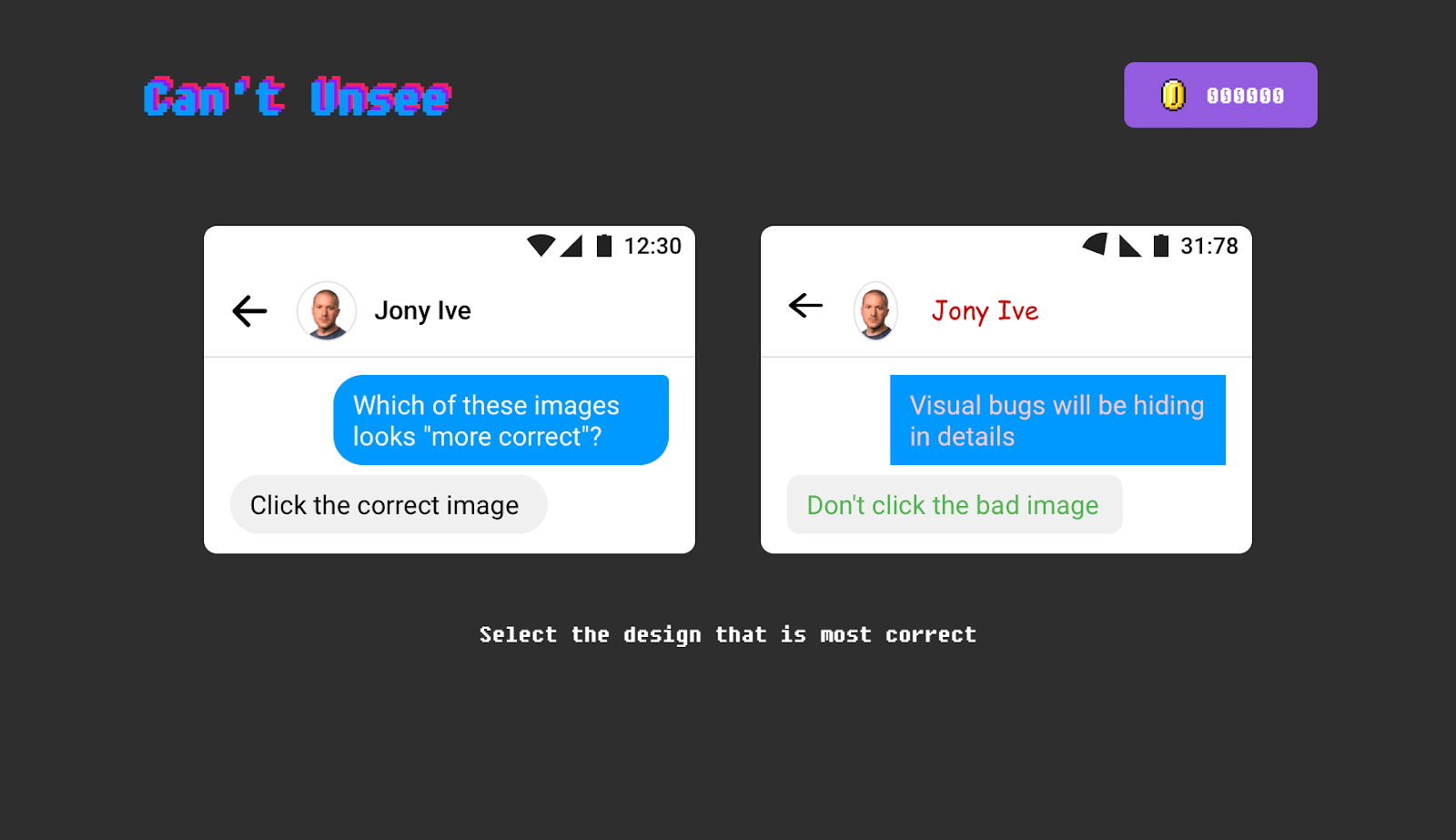
For nondesigners or even junior designers, obsessing over these details may seem unnecessary. I’ve found the design game Can’t Unsee to be a useful tool for conveying UI nuances to clients and other team members, as it helps them see for themselves the difference that details can make.
Error and Empty States: Cater, Don’t Fret
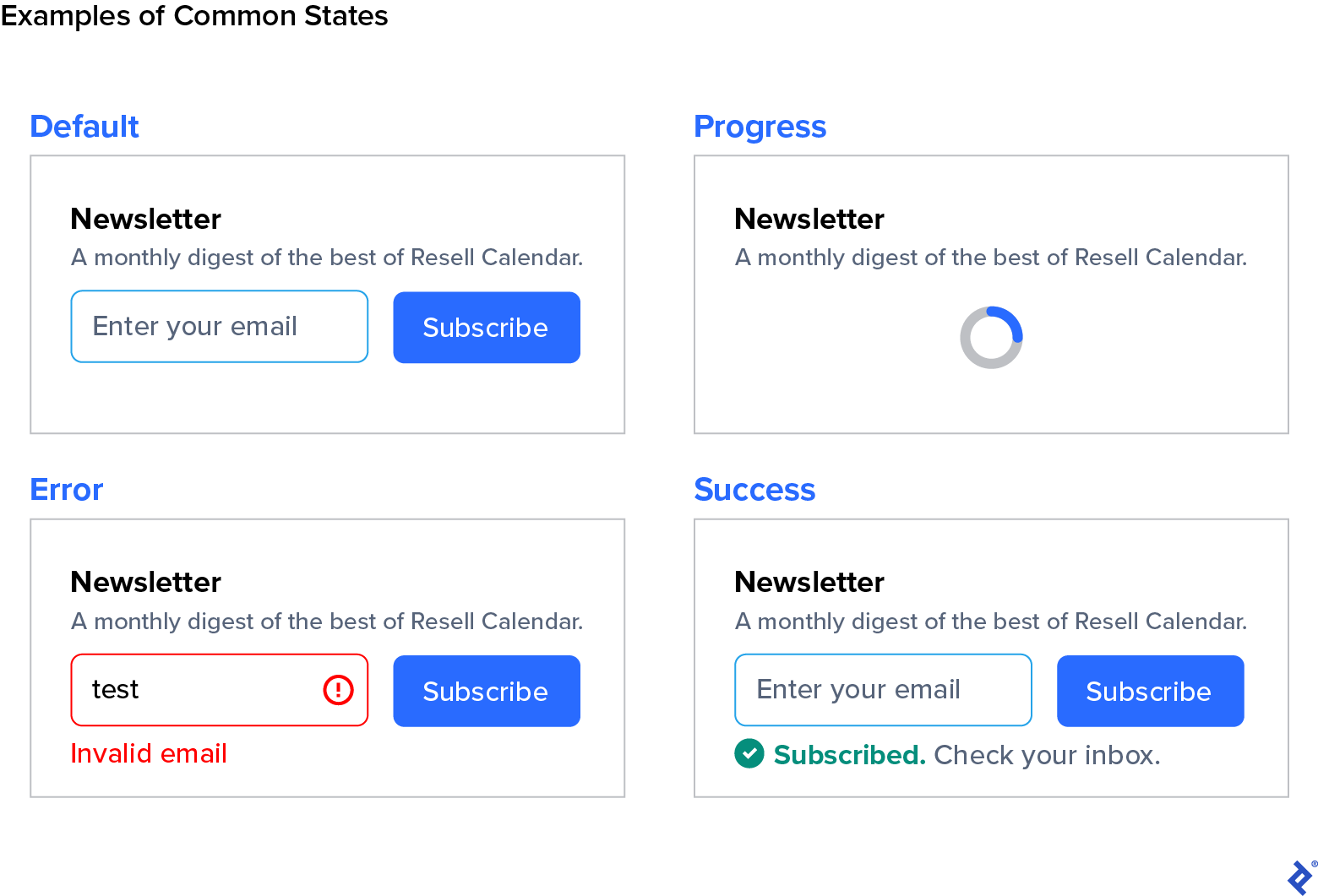
States tell the user the status of a UI element. Designing for various possible states (from error to success) guides the user along their journey.
Startups often focus on the happy path—a frictionless journey to the user’s goal—and fail to design for bumps in the road. To provide the best experience, however, cater to the following states (at minimum):
- Default
- Progress
- Error
- Success
- Empty
- Interactive (hover, active, pressed, disabled)
Even within these categories, focusing on the most crucial actions is beneficial. Thus, displaying a generic error message is acceptable if an error occurs during part of the user experience that isn’t critical (e.g., a user favoriting a search result item). But let’s say a purchase fails to process on a ticketing website. Because that’s a much higher-stakes flow, you should notify the user about what exactly caused the error. Network problems? Declined payment method? The more consequential the action, the more it’s worth investing in contextual messages to fix the error.
Depending on your site content, you may choose to cater to additional states, such as imperfect states. It’s easy to overoptimize, so if you go beyond the essentials, select states that achieve a specific objective.
Aim for “Good Enough” Image Quality
Blurry images, of course, must be fixed. But if you’re deliberating over image quality on the higher end—choosing among medium, high, or very high quality settings when exporting images from Photoshop, or deciding between 70% or 80% compression, err on the side of smaller file size. If you can’t immediately notice an improvement between two images of different quality, your users won’t either.

Larger images can slow page loading (which your user will notice), impacting user experience, conversions, and Google rankings. While your product should inform decisions around imagery—larger images would be more impactful for a luxury brand than for a government website—in general, use the smallest file size you can get away with.
Use a Ready-made Icon Set
There are many ways to differentiate a fledgling product. Iconography isn’t one of them.
Any startup that invests in a completely custom icon set is wasting its money, whether bootstrapped or funded. Instead, choose an icon library like Google’s Material Symbols. Occasionally you may need a specific icon that a ready-made set doesn’t possess, but it’s more efficient to add (sparingly) to an existing library than to create one from scratch.
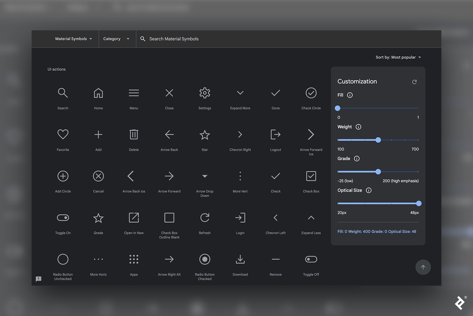
Users—and businesses—get far more value from a startup’s investment in additional features and better usability than from unique icons. It’s bewildering to interact with a startup website that seemingly had the budget for a custom icon set but didn’t want to spend money fixing bugs, poor accessibility, and lackluster performance.
For Animations, Simple Does It
Animation in digital design can capture and direct attention, improve usability, increase readers’ understanding of data, and amplify moments of delight (like reaching a new level in a video game or completing a purchase).
But in web UIs, fancy animations are largely a time sink that easily doubles, triples, or quadruples the scope for a particular UI component. Furthermore, scroll-triggered animation—like parallax scroll or fade-ins—can backfire and frustrate rather than delight users.
Any animation in the UI should be purposeful. Thus, luxury brands, where visual splendor is a prerequisite, may employ carefully designed motion graphics and animations to support brand expectations—as seen on Rolex’s home page. But for the vast majority of brands, no or minimal animations in web UIs is best to avoid usability issues and reduce jank.
Don’t Worry About Subtle Browser Irregularities
Web browsers interpret font weights and assign vertical spacing differently. And various operating systems render fonts uniquely, using their own anti-aliasing methods. As a result, the same page will appear slightly different depending on the user’s browser and operating system. In most cases, the irregularities are negligible, and it’s not worth the resources to try to make the page perfectly consistent across all browsers.
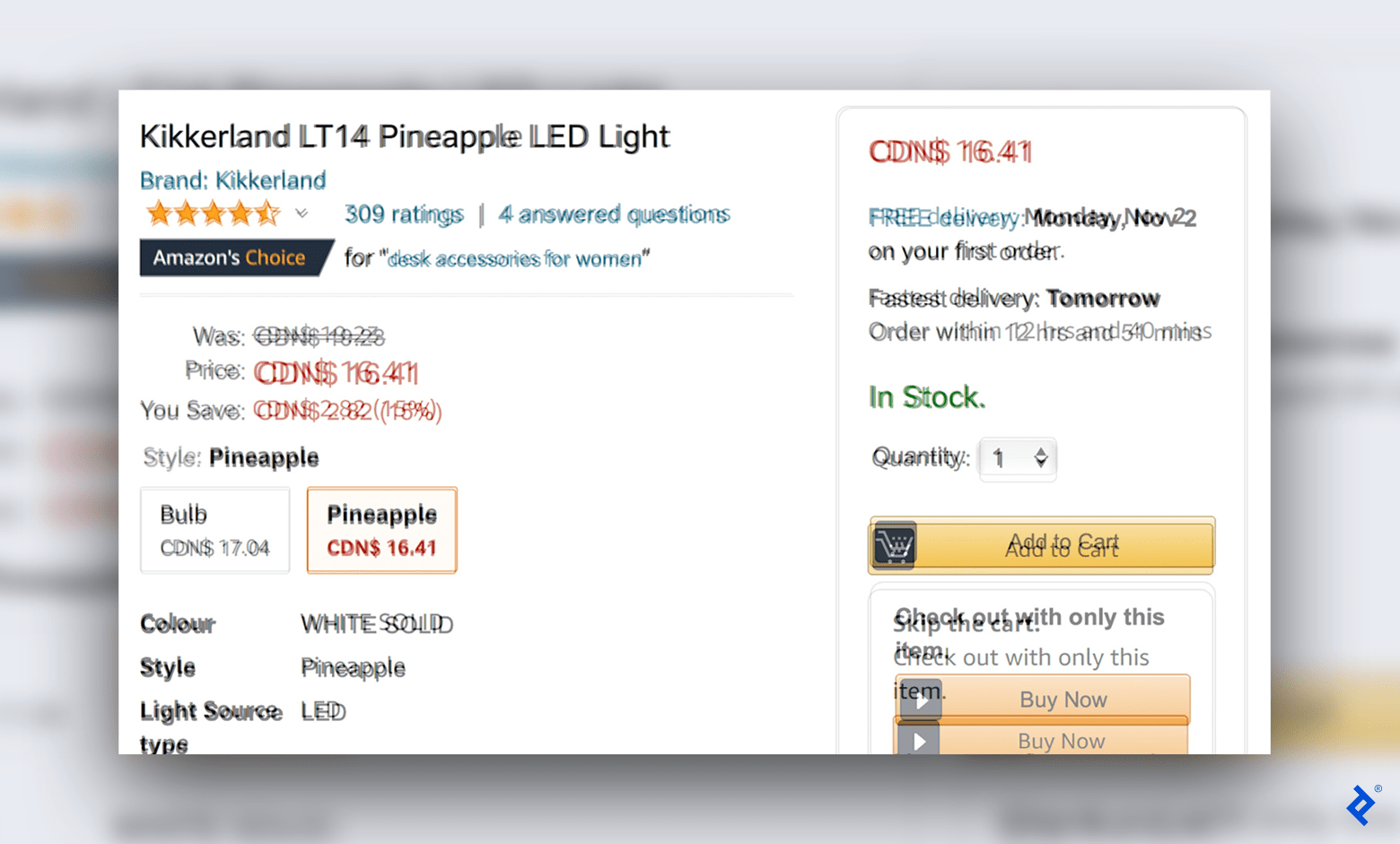
I’ve worked with clients who requested browser renderings to be carbon copies of mockups, going so far as to tweak line height from 20px to 20.2px to achieve perfection. Optimizing for every system creates an ordeal of never-ending iterations—and to what benefit for the user?
You could spend hundreds of hours trying to optimize for every minute detail, and the final output still won’t look quite like it does in the original mockup. Instead of chasing this elusive dream, move on. There are better ways to deliver value, especially for a startup.
Don’t Try to Optimize for Every Possible Screen Size
Endless combinations of device sizes, screen resolutions, and pixel densities exist. Responsive design adapts content depending on the user’s screen size. While you should optimize your website for various devices, optimizing for every possible combination of viewport pixel resolutions isn’t realistic.
The pragmatic approach is to create a fluid design and optimize for three to six breakpoints—the points where the website will automatically transform for viewing on a specific screen size. Below is a default set of breakpoints, ranging from the smallest phone to a large monitor.
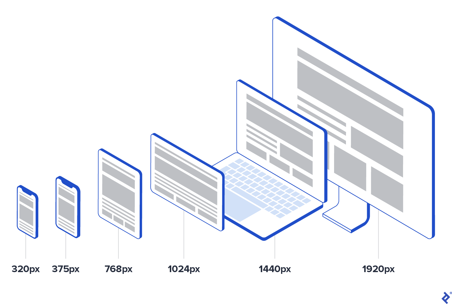
There may be some minor discrepancies in the UI for devices that fall between breakpoints. Perhaps the space utilization won’t be perfect at the far end of one breakpoint before reaching the next one, or some elements could look wider than ideal. The UI must be usable on all breakpoints (a nonnegotiable), but optimizing for several different phone, tablet, and computer sizes would take substantial time and effort without much benefit.
Consult Google Analytics, specific project requirements, and stats on the most common screen resolutions to determine the right breakpoints for your website. For example, a tech brand may opt not to cater to the smallest and cheapest phone size (320px), instead focusing on 360px based on its audience’s preferred devices. Or web analytics may reveal that traffic from large monitors is less than one percent of all web visits. In that case, it may not be worth the extra design and development time to cater to that breakpoint.
Meta Tags Matter
A user’s experience with your product starts before they land on your website. How a link to your content appears in Google search results, on social media platforms, or in direct messages can prompt users to click through—or not.
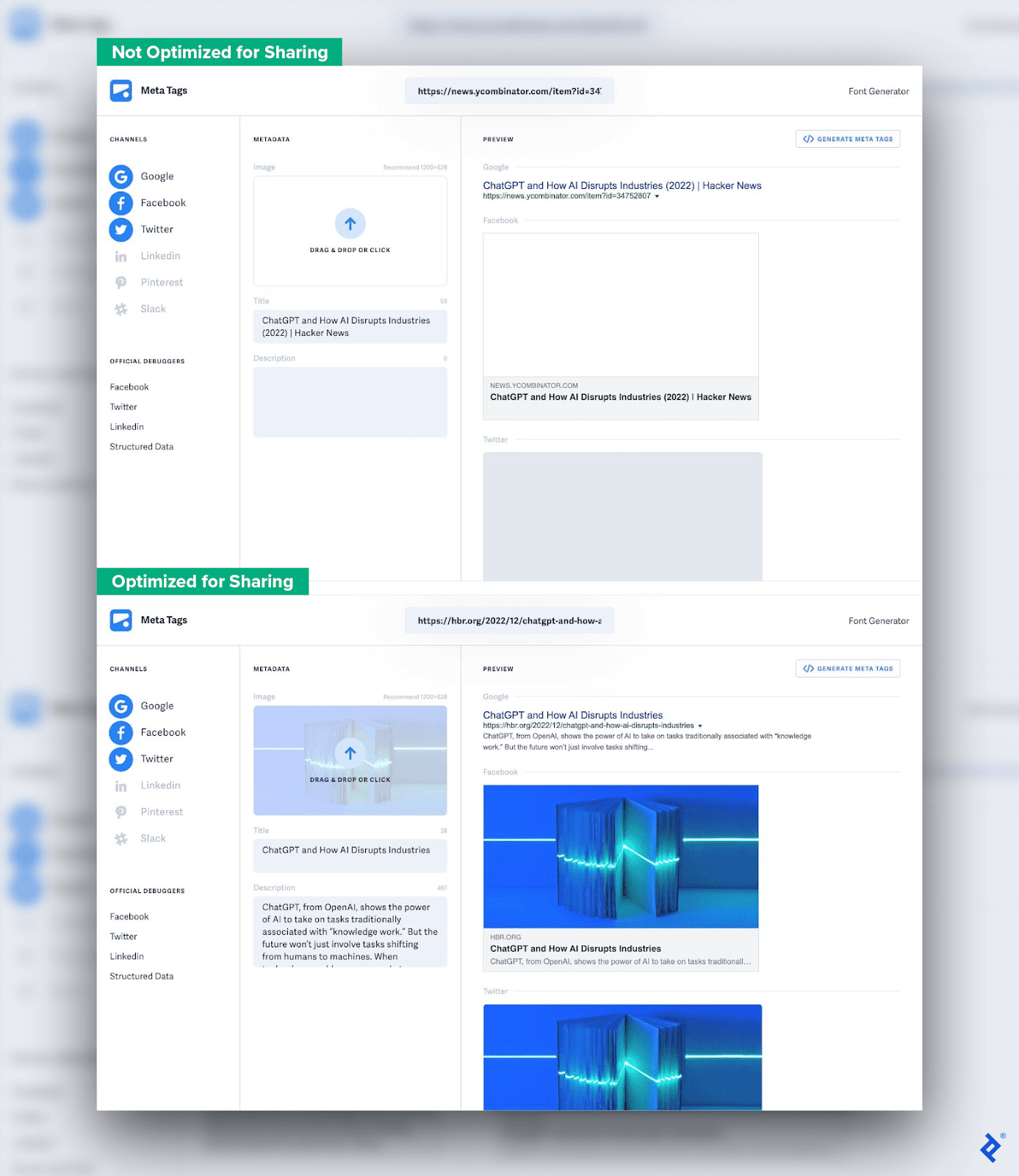
Optimizing a website for social media sharing is often overlooked by startups, but it’s well worth the effort. This comparison shows the difference between an article that is not optimized for sharing and one that is optimized.
The top example doesn’t include proper meta tags, so the link previews on Google and Twitter are bare-bones—not very enticing to click. In contrast, the bottom example with meta tags shows a preview image and a description that tells the user what the content is about.
According to HubSpot data, sites that rank highly in search engine results optimize their content for search intent, and one of the top strategies for doing so is writing effective title tags and meta descriptions. Prominent meta tags to include are title, content type, description, image, and URL.
The Balancing Act: Pragmatic Pixel-perfect Design
Design speed matters, but if your product is mediocre, it’ll get overshadowed by competitors. Conversely, even an excellent product will struggle to get off the ground if you wait for it to be perfect before launching.
I often see startups push for speed and lower costs over quality. Speed may be crucial to success if a business is racing to conquer a new niche market, however, most markets are already saturated, and even when a new market emerges, it saturates rapidly. (After ChatGPT went viral, for example, more than 150 AI chatbot apps launched in the first quarter of 2023.)
Designers who take the pragmatic pixel-perfect approach balance quality and speed by focusing on what truly adds value to a product and letting go of what doesn’t. With a business mindset, they understand that accelerating production can often reduce the quality of products and services, ultimately impeding value. And they help startups validate their product-market fit by creating high-quality user experiences—fast.
Further Reading on the Toptal Blog:
Understanding the basics
What is pixel-perfect design?
Pixel-perfect design maximizes design fidelity down to the pixel. With a laser focus on quality, a design that is pixel perfect looks nearly identical across different devices. While quality is an admirable goal, this level of perfection doesn’t necessarily add value for the user.
How important is page speed?
Page speed, or how fast a website loads, impacts user conversion and page views. Google also evaluates page speed when determining search rankings. To shorten a site’s loading time, designers should avoid large image files and use no or minimal animations.
Do more pixels mean better quality?
For images, more pixels create higher resolution, but larger image files can also slow down page speed. To build quality web UIs, focus on crucial priorities like website performance and UI consistency.
Geelong, Victoria, Australia
January 13, 2020
About the author
Damir is a digital designer who has created payments systems at Booking.com, open-data portals for Australian state governments, and the search experience at Envato Market. He has also facilitated design sprint workshops at Harvard University, been a lead UX instructor at General Assembly, and led AR/VR design at Archimedes Digital.
Previous Role
Lead Product StrategistPREVIOUSLY AT

