The Future of User Interface Design: Next-generation UI Tools
The next wave of UI design tools will fully integrate design and code to provide a seamless experience for designers and developers.
The next wave of UI design tools will fully integrate design and code to provide a seamless experience for designers and developers.
Damir is a digital designer who has created payments systems at Booking.com, open-data portals for Australian state governments, and the search experience at Envato Market. He has also facilitated design sprint workshops at Harvard University, been a lead UX instructor at General Assembly, and led AR/VR design at Archimedes Digital.
PREVIOUSLY AT

UI design tools have come a long way since the first generation of Adobe Photoshop, a program intended for editing photos, not creating dynamic user interfaces. The current generation of tools, such as Adobe XD, Figma, and Sketch, have made our jobs easier and faster.
Yet inefficiencies in our everyday workflows abound, and we’re wasting precious time and resources when we could be designing products that people want to use. The design programs available today are superior to what we started with, but they fail to capitalize on current technology and prevent us from realizing our full potential as UI designers.
It’s time for a future of UI tools.
Integrating Design and Code
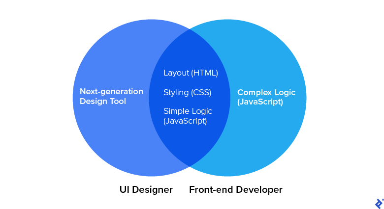
Future UI design tools will bring design and code together to provide a more seamless experience for designers and developers. Our current tools aren’t helping us design web UIs; they’re helping us design abstract representations of web UIs. Mock-ups made in Figma and Sketch are disconnected from source code.
Today, many designers know the basics of HTML and CSS. Some hard-liners design in code, but that isn’t effective for complex projects; designers need the ability to explore a proof of concept quickly before committing to it.
Software developers have Visual Studio Code, a tool that unites code editing and development, and allows engineers to build, test, and debug code in the same environment. Similarly, designers need a visual-development environment that provides full design capabilities yet also generates production-ready code.
Here’s what the future of UI design holds.
Parallel Creation Will Replace Designer/Developer Handoffs
There’s too much back-and-forth between designers and developers, especially during the handoff phase. In some cases, handoff is so time-consuming and exhausting that the quality of work suffers. With next-generation design tools interfacing with the source code, developers will no longer be solely responsible for building new UIs. Instead, they will be able to focus on developing the logical architecture that connects a product’s UI to its back end and makes it operate properly.
Designers will lay the foundations of UIs with the code baked in, and developers will build upon this code to breathe life into products. No longer will designers need to nag developers with requests like “Please add 16 px of padding instead of 8 px, as shown in the mock-up.” And developers won’t have to pause to ask design questions such as “How should this component scale between tablet and desktop breakpoints?”
Instead, designers and developers will partner on weightier issues such as whether a design approach is viable given time and budget or whether all of the UI design and development components have been addressed.
Design UI Tools and Developer Software Will Align
Current tools rely on bespoke programming models to generate design components. These models generally aren’t as robust as CSS and don’t allow designers to see the auto-generated code underlying their design files—code that must ultimately be exported to HTML, CSS, or JavaScript. It would be much simpler if our tools used HTML and CSS natively.
For instance, CSS uses the box model, which calls for placing the HTML elements on each page within a box that is coded to define its height, width, border, and padding. Figma comes close to providing this capability with its auto-layout feature. But if Figma used the box model that already powers most web UIs, developers would need to translate and export less.
The same is true for style inheritance, which controls what happens when no style is specified for a specific element—similar to a default. CSS uses it, but most design tools, which were not created to be web-specific, do not.
We need our tools to output web views, not static artboards or mock-ups. We don’t need HTML and CSS simulators. We need HTML and CSS.
Mock-ups Will Become Obsolete
Instead of throw-away mock-ups, let’s throw mock-ups out the door.
Mock-ups leave too many questions unanswered. It’s unfeasible to design one for every digital environment. Today, designers build layouts for screen widths of 320 px, 834 px, and 1440 px; but what happens if part of the layout breaks on a 1220 px viewport? And why not optimize for 375 px, a common size for today’s larger phones?
Creating an artboard for every scenario is impractical, especially when considering all breakpoints and views—not to mention dark themes. Designing for all of these variables compounds the number of artboards beyond reason.
Mock-ups are also a waste of resources. They are time-consuming to build and have become less prominent in digital product design. Webflow has done away with mock-ups and instead advocates for responsive, interactive prototypes. (Unfortunately, Webflow is limited to web-based solutions and caters to simple websites). And while throwaway deliverables might make sense during ideation, they’re a waste during the solution phase.
All System States Will Be Accounted For
All digital products have states that correspond to what they are doing at a given moment—for instance, stalling during loading or displaying an error message.
Every state must be considered, but current UI tools leave this task to designers, forcing them to create numerous variants of a single component. The development tools React and Vue.js allow developers to easily adjust for all possible states of a component. Design tools must follow suit and encourage designers—nag them, even—to ensure that all component states are designed for.
Real Data Will Replace Placeholder Content
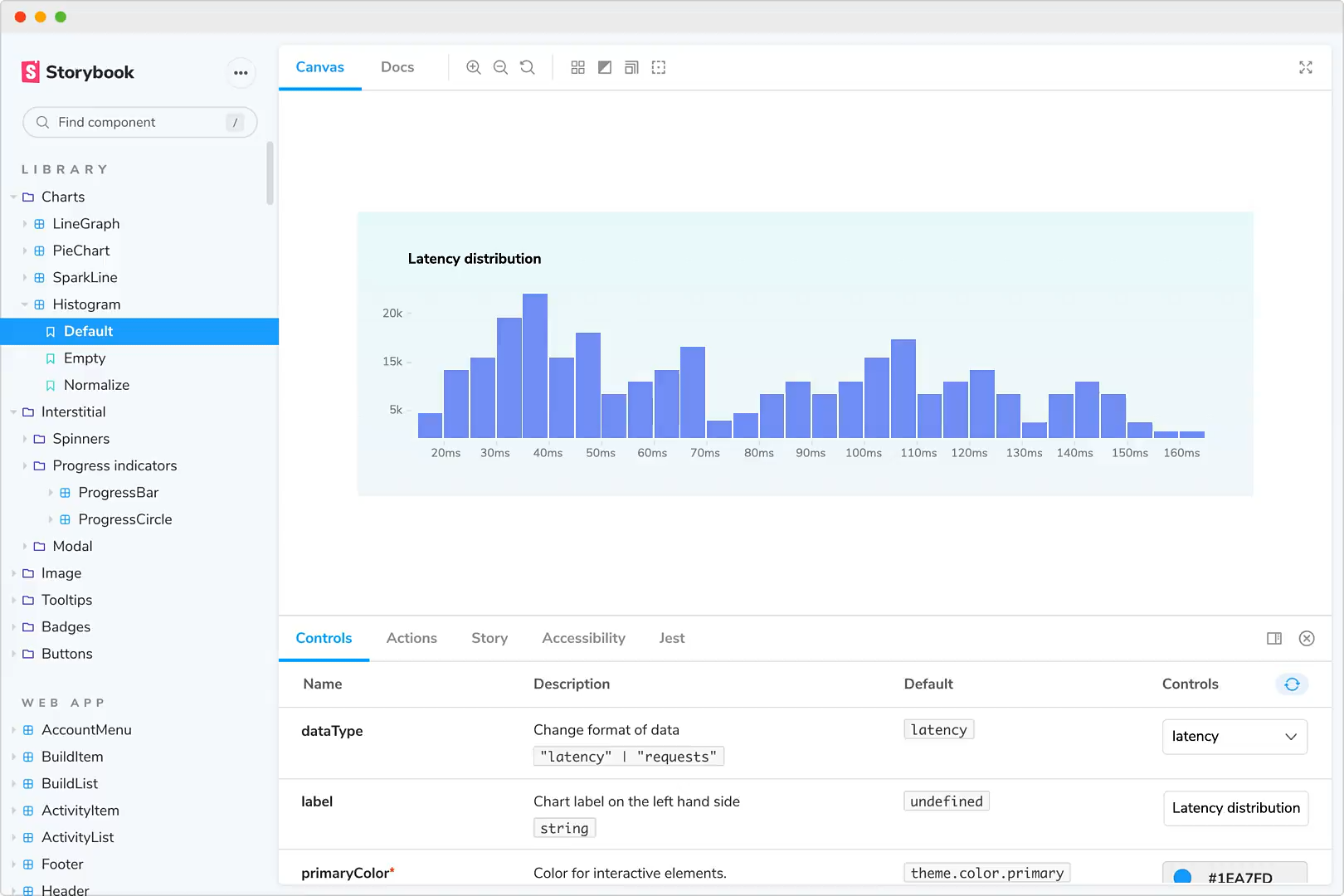
Just as designers create components for multiple states, they also design for a wide variety of data. UI designers need to be able to test their components with the actual input—the copy, images, dates, names, titles, and more—that will ultimately populate the components in their designs. Currently, designers can only simulate data by manually copying and pasting it into artboards, an extremely tedious task. There are plugins that can help automate this process, but they are cumbersome.
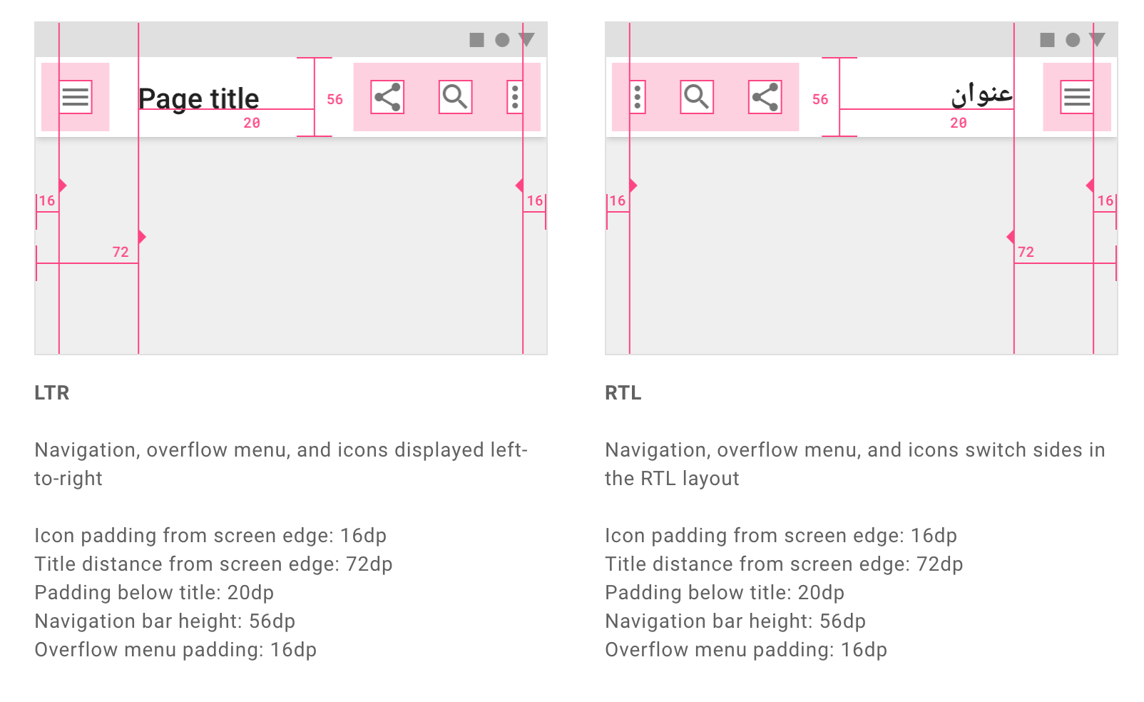
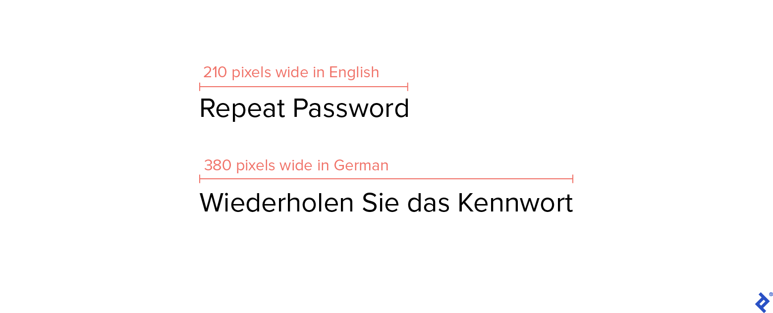
Asking developers to evaluate how components handle data isn’t the answer either. By the time components get to testing, it’s too time-consuming to redesign them. And if designers can’t test and iterate components with real data, how will they know whether a card works with a long title—or no title at all? How will they discover that a font doesn’t support Arabic characters or that a site doesn’t accommodate languages that are read from right to left?
Edge-case Testing Will Become Easier
When future UI tools finally cater to all states and enable real data testing, designers will be able to better anticipate edge cases. Once a component is created, designers will stress test its various states, blasting it with diverse data to see how it performs in different scenarios. In this way, the UI will become the designer’s domain—freeing developers to concentrate on tasks such as fixing the JavaScript or testing the APIs.
A World of Developer Tools and Third-party Browser Extensions Will Open Up
Once our work lives in HTML and CSS, a whole ecosystem of extensions will become available during the design phase, like the indispensable Lighthouse for performance, SEO, and accessibility audits, or the various browser developer tools that simulate device breakpoints and low network speeds. The browser tool set is much more valuable for creating and testing production-ready UIs than any of the plugins in Figma, Sketch, or Adobe XD.
Designers and Developers Will Work in Parallel
I liken the current state of product development to a kitchen in which one chef is trying to cook a dish by dictating to another chef what to do: It might work, but it will take significantly longer and be far less efficient. There are companies developing code-based design tools—Hadron, Modulz, and Relate have products in beta. Widespread adoption of these tools will mark the beginning of a revolution in digital-product creation.
It will also signal a radical shift in the designer-developer relationship. With the two sides working in parallel, product teams will become exponentially more efficient. Developers will be free to tackle the complex logic of UI architecture instead of wasting time interpreting mock-ups or getting bogged down by designers asking them to nudge pixels to perfection. And designers will be more valuable to their teams and companies as they become co-builders of successful digital products.
Further Reading on the Toptal Blog:
Understanding the basics
Does UI design have a future?
UI design tools have come a long way in the last 10 years, but they still cause a number of workflow inefficiencies. In the near future, UI design tools will bring design and code together to create a more seamless experience for designers and developers.
What is the best method to hand over UI design to a front-end developer?
Today’s UI tools result in too much back-and-forth between designers and developers. A new generation of design tools is on the horizon that will interface with source code and allow developers to focus on making sure that products operate properly.
Do designers need to code?
While many designers know coding basics, most projects don’t require designers to do any coding. Instead, designers usually pass their work off to developers who implement the code.
Damir Kotorić
Geelong, Victoria, Australia
January 13, 2020
About the author
Damir is a digital designer who has created payments systems at Booking.com, open-data portals for Australian state governments, and the search experience at Envato Market. He has also facilitated design sprint workshops at Harvard University, been a lead UX instructor at General Assembly, and led AR/VR design at Archimedes Digital.
PREVIOUSLY AT

